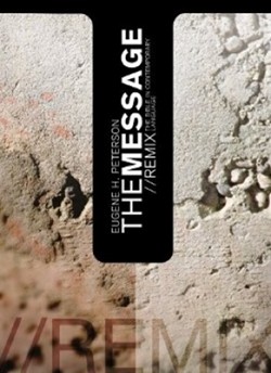
The demographic trend toward conservatism is not the whole story with the growth of conservative churches in the US. Design is a big part of that success. Check out the feel of the Mars Hill Church College site and a related site, Flannel. Looking for a clean and eminently readable bible? The typography of Message: The Remix, shown here, can’t be beat. Relevant Magazine seemlessly integrates a fairly conservative viewpoint into a downtown, hipster format. Design is part of the content,part of the message, not just window dressing.
Mainlines are trying, but it’s not enough. Standing out in the left pews, the theologically liberal United Church of Christ has been making a serious effort these last ten years, particularly with the “God is Still Speaking” campaign and the looser language of their website. Still, compare this to Mars Hill. Which church “gets” their audience?
If mainstream, protestant Christians are serious about reaching a younger demographic, they need to get serious about design; seriously serious. If these institutions are not percieved as relevant to a younger, not-dying demographic they will disappear with their elderly parishioners. Now would be a good time to begin.
