It is very easy for new designers to have difficulty with line length. Like most typographic principles, It is not something we are taught throughout school. We arrive fresh to the concept at college. Bad line length choices give your design an amateurish feel. Master proper length and your layouts will gain clarity and polish. Below is a post by Anthony Jones explaining clearly what it’s all about. The original can be found here. Read it. Love it. Do it. Teach it to others.
Typography 101 – Line Length
Line length is pretty much what it says on the tin. It is the maximum length of a single line of text before the next word in a sentence ‘wraps’ onto the next line underneath. This is correctly referred to as the ‘measure’ of a paragraph which seems to be a dying phrase.
Here’s the deal. The eyes and brain can only stay focused on a line of text for so long before fatigue kicks in and the reader loses position which destroys the reading process. Some boffins once came up with an optimum line length of an alphabet and a half, or about 39-45 letters. This is obviously far too prescriptive a rule to maintain but it does serve as a yard stick when evaluating a paragraph or column of text for good readability.
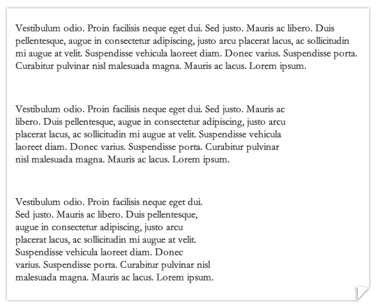
The example above shows 3 paragraphs of text with progressively smaller line lengths. As the line length decreases the readability increases.
Specific layouts will require you to dictate varying line lengths every time you set copy. Often, other factors like a maximum screen or page area and underlying grid systems will make most of the decisions for you, but just remember the basic rule that in almost all cases the shorter the line length the easier it is to read.
