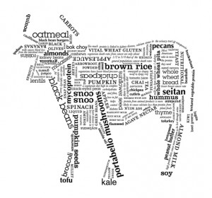
A mother had 17 cows and three children. Then she died.
Her will specified that the oldest should have 1/9th of her estate as he was doing quite well and didn’t really need more cattle. The middle child was to take 1/3rd. The youngest, who had just reached adulthood, was to be given 1/2 half of the estate to get his feet on the ground. The children believed the proportions were fair but were baffled about how to fractionate the cattle without killing a few. After much frustration, they decided to consult the village’s wise woman. The wise woman agreed that there wasn’t a way to divide the inheritance of 17 cows without slaughter, so, she offered one of her cows to the children, growing the estate to 18 cows.
The eldest took 2 cows. (18/9)
The middle took 6 cows. (18/3)
The youngest took 9 cows. (18/2)The remaining cow was gratefully returned to the wise woman.
And so it is with typesetting. Oft times we struggle with a typographic puzzle for quite some time before considering copy edits. Small alterations can make a big difference.
Easy places to alter the color of your type include
- use or abandonment of abbreviations
- baseline moves for symbols (e.g.: dollar signs, time zones)
- varied, synonymous linking phrasing (e.g.: also, in addition, in addition to, move over)
While you will have to run reworked copy past your client, many times the copy editor will go with the recommended change if done with sensitivity.
The pro-vegetarian cow image at the top was created by Michelle Fleming, a student designer in Maryland for her Type 2 class.
