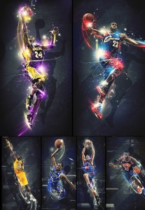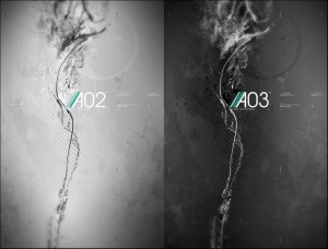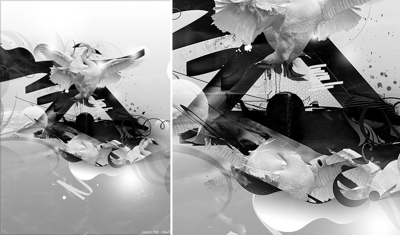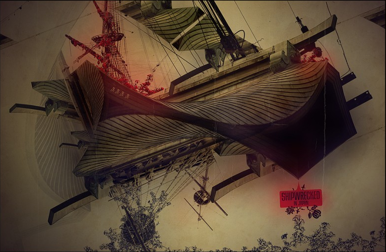
UK designer, artist and illustrator Pete Harrison gives static advertising a bolt of color and energy. Ofazomi finds his subtle, personal work to be far more compelling than the colorful electricity of most of Harrison’s commercial images. However, all of Harrison’s work is interesting in the way he uses traditional compositional techniques. Check out the excellent image below with the intertwined swans. The structure relies on rennaisance mother-and-child setup. The cruciform layout of AO2 is also interesting as is the baroque layout of Shipwrecked in Japan, above. See, those art history classes do matter… Check out Pete’s portfolio: HERE.
