(This tidbit is from Emigre. Go read the whole thing: here!)
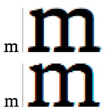
The variables of screen display generated by different browsers, screens, and user preference settings generate inconsistencies that are difficult to control. The above example shows the Malaga Regular web font lower case m at 24 px, and a 500% enlargement. The top image is from the Macintosh Operating System. The bottom image is Windows ClearType display. Both display samples are taken from an LCD screen.
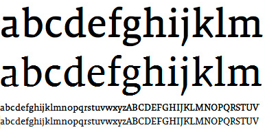
Two sizes of the Malaga Regular web font shown in the extreme scenarios. In each size the top line is from the Macintosh Operating System. Bottom line is Windows ClearType display.

