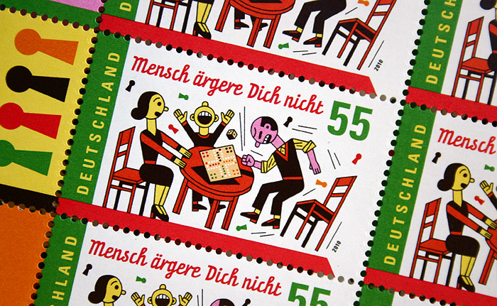
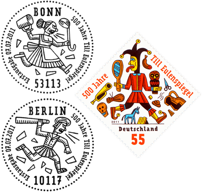
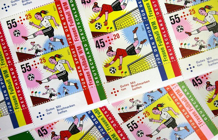
 Graphic designer, professor and typographer Henning Wagenbreth has created some great postage stamps. See more stamps and learn about the process here. Learn more about Wagenbreth’s typeface, Prater, here. Visit the designer’s site here.
I like using the Prater family, because it goes well with my drawings. Well, that is what it was made for! Its forms are relatively strict. Still, it is somewhat dynamic, with its modulated stroke weight and its deviations from the vertical and horizontal. What I like about Akzidenz-Grotesk is that it is a timeless design, with neutral forms. Furthermore, it is available in all kinds of styles. This enables me to pick a size, width, and weight that goes well with the rest of the design. Typestar comes into play when neither Prater nor Akzidenz-Grotesk were considered appropriate. Or maybe also when I wanted to achieve a slightly more modern look, without being too trendy. –Henning Wagenbreth


