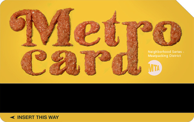
While this student MetroCard design project celebrating the meat packing district of NYC brings humor to hamburger, a similar, glitter-covered treatment of the gay-friendly Chelsea (not shown) is slightly offensive. Still, this is a great idea for what could be a standout, academic project. See more: here!
