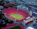
Here’s a nice bit of open source. (The download is a bit wonky, though. Go here: download.)

(SpeckyBoy has some nice examples of tilt shift photos up on their site. A few are here as well as some links. Go read the whole thing.)
Tilt shift photography makes real life look like a model train set. This is best done with a specific lens with a shot taken at high angle but can also be faked to some extent in Photoshop or online at tiltshiftmaker.com.
How to Create Real Life Tilt Shift Images
In order to add a good miniature effect to your photos, you need to take photographs from a high angle, possibly from the air. Taking pictures from a high angle create the illusion as if you are looking down at a miniature subject. You will need a camera with a tilt-shift lens as this stimulates a shallow depth of field.
Here are some guides to help you:
- Focusing the Tilt-Shift Lens ?
- Tilt Shift Lenses: Depth of Field Tilt Shift Lenses ?
- Tilt Shift Lenses: Perspective Control ?
- Why does tilt-shift photography make things look tiny? ?
- Tilt/Shift Photography Links ?
How to Make Fake Tilt-Shift Photos
Just in case you do not have a camera with a tilt-shift lens (it is an expensive piece of kit after all), then you can use these Photoshop tutorials to give your photographs the miniature tilt-shift look. you can see above. Here they are:
Are you wondering how to protect your valuable graphic design content from the prying eyes of Pinterest? Me neither. What if you show a client an online comp that you don’t want pinned? As content creators we should at least be able to slow down that little Pinbot. Here’s how:
In the head of your web page place this code:
<meta name="pinterest" content="nopin" />
The next step would be Pinterest-side code development that reads buried metatags and refuses to pin stuff, even if it has already been swiped and is on someone else’s page. Still, this is a start.
(Thanks to Mark and his keen eye for intellectual property issues for the head’s up on this one!)

There is a decent story up on abduzeedo.com about the design process. Included is a great series of images showing a inspired and well thought out logo and application by Roger Oddone.
You want your work to be like this, right? Why aren’t your logo projects this elegant and straightforward? This project wasn’t either. The secret here is that a whole lotta dead ends have been left out and we don’t see the client-designer interaction. Here in the real world clients have opinions and those opinions win. A more accurate idea the multi page mess exerpted below. With the caveat that you should draw 20-100 thumbnails to come up with the first five ideas, a handy logo design guide can be downloaded here.