
The point of our vocation is to make information easily understood. Unfortunately, at this time, there is no university course to help designers learn how, exactly, they are to design for dyslexia. Below are two dyslexia style guides and their source sites. Both of these are listed in our Typography Resource section: here. Please submit additional links should you know of any.

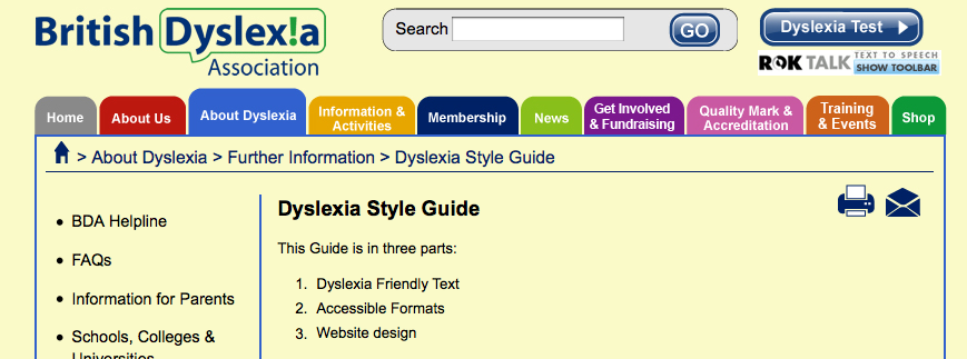
(source: http://www.bdadyslexia.org.uk/about-dyslexia/further-information/dyslexia-style-guide.html)
This Guide is in three parts:
- Dyslexia Friendly Text
- Accessible Formats
- Website design
1. Dyslexia Friendly Text
The aim is to ensure that written material takes into account the visual stress experienced by some dyslexic people, and to facilitate ease of reading.
Adopting best practice for dyslexic readers has the advantage of making documents easier on the eye for everyone.
Media
- Paper should be thick enough to prevent the other side showing through.
- Use matt paper rather than glossy. Avoid digital print processing which tends to leave paper shiny.
- Avoid white backgrounds for paper, computer and visual aids. White can appear too dazzling. Use cream or a soft pastel colour. Some dyslexic people will have their own colour preference.
Font
- Use a plain, evenly spaced sans serif font such as Arial and Comic Sans. Alternatives include Verdana, Tahoma, Century Gothic, Trebuchet.
- Font size should be 12-14 point. Some dyslexic readers may request a larger font.
- Use dark coloured text on a light (not white) background.
- Avoid green and red/pink as these are difficult for colour-blind individuals.
Headings and Emphasis
- Avoid underlining and italics: these tend to make the text appear to run together. Use bold instead.
- AVOID TEXT IN BLOCK CAPITALS: this is much harder to read.
- For Headings, use larger font size in bold, lower case.
- Boxes and borders can be used for effective emphasis.
Layout
- Use left-justified with ragged right edge.
- Avoid narrow columns (as used in newspapers).
- Lines should not be too long: 60 to70 characters.
- Avoid cramping material and using long, dense paragraphs: space it out.
- Line spacing of 1.5 is preferable.
- Avoid starting a sentence at the end of a line.
- Use bullet points and numbering rather than continuous prose.
Writing Style
- Use short, simple sentences in a direct style.
- Give instructions clearly. Avoid long sentences of explanation.
- Use active rather than passive voice.
- Avoid double negatives.
- Be concise.
Increasing accessibility
- Flow charts are ideal for explaining procedures.
- Pictograms and graphics help to locate information.
- Lists of ‘do’s and ‘don’ts’ are more useful than continuous text to highlight aspects of good practice.
- Avoid abbreviations if possible or provide a glossary of abbreviations and jargon.
- For long documents include a contents page at the beginning and an index at end.
Checking Readability
To set your spell checker in Word 2003 to automatically check readability, go to Tools, Options, Spelling, and Grammar, then tick the Readability request. Word will then show your readability score every time you spell check.
In Word 2007 Click the Microsoft Office Button, and then click Word Options. Click Proofing. Make sure Check grammar with spelling is selected. Under When correcting grammar in Word, select the Show readability statistics check box.
Check long documents in sections, so that you know which parts are too hard.
- Flesch Reading Ease score: Rates text on a 100-point scale; the higher the score, the easier it is to understand the document. For most standard documents, aim for a score of approximately 70 to 80.
- Flesch-Kincaid Grade Level score: Rates text on a U.S. grade-school level. For example, a score of 5.0 means that a fifth grader, i.e. a Year 6, average 10 year old, can understand the document. For most standard documents, aim for a score of approximately 5.0, by using short sentences, not by dumbing down vocabulary.
2. Accessible Formats
It is important that documents and publications are prepared to be accessible in alternative formats for people with visual impairments or reading difficulties. These should include availability in electronic format which can be read by screen reading software.
Printed documents are created in computers, so it should be possible to issue the electronic files. Some documents will only be available electronically.
- Word files are the easiest for individual viewing preferences and for listening.
- Portable Document Format (PDF) files keep the presentation better than Word files, but are not as easy to use.
- We suggest offering both the source Word files and derived PDF files where possible.
- Publicise availability of accessible formats.
Preparing a document for text-reading software:
- Listening to a document using a text reader will take longer than visual reading.
- Put full stops after headings to make the voice drop and pause; a pale tint similar to the background colour will make the dots less visually distracting.
- Put semi-colons, commas, or full stops after bullet points to make a pause.
- Use Styles in Word to organise headings and formatting.
- Avoid automatic numbering as some text readers will not read these. Use manual.
- Contents Page listings should be hyperlinked to the relevant section to aid navigation. Number menu items.
- Use internal and external hyperlinks for ease of navigation.
- Avoid text in capital letters in mid-line, as they may be read as single letters.
- Include as few signs and symbols as are absolutely necessary, e.g. asterisks or dashes (both short and long), as these will be spoken.
- Long dashes should be avoided: use colons to make the voice pause.
- Use straight quotation marks. Curly or slanting ones may be read out as ‘back quote’ by some screen readers.
- Avoid Roman Numerals and No. for number.
- Consider whether abbreviations and acronyms need full stops.
- Text readers may have difficulty with tables in Word and may not automatically move on to the next cell without manual use of the Tab key.
- Avoid text in images. Listeners cannot hear it. Repeat in the main text.
- Use hyphens in compound words to aid text reading pronunciation.
- Chunk phone numbers to avoid being read as millions or hundreds of thousands.
3. Website design
Website design must consider all the above factors together with the following points.
Research shows that readers access text at a 25% slower rate on a computer. This should be taken into account when putting information on the web. When a website is completed, check the site and information for accessibility by carrying out these simple checks.
- Navigation should be easy. A site map is helpful.
- Use graphics, images, and pictures to break up text, while bearing in mind that graphics and tables may take a long time to download.
- Very large graphics make pages harder to read.
- Offer alternate download pages in a text reader friendly style.
- Where possible design web pages which can be downloaded and read off-line.
- Moving text creates problems for people with visual difficulties. Text reading software is unable to read moving text.
- Contents links should show which pages have been accessed.
- Most users prefer dark print on a pale background. Colour preferences vary.
- Some websites offer a choice of background colours.
- Encourage the use of hyperlinks at the end of sentences.
- Avoid green and red/pink as these are difficult for colour-blind individuals.
- Make sure that it is possible for users to set their own choice of font style and size, background and print colours.
Further information on Web Design and adaptation:
Distilled design of B.D.A. web:
http://www.distilled.co.uk/blog/distilled/usability-versus-dyslexia
RNIB Web Access Centre: http://www.rnib.org.uk/professionals/webaccessibility/Pages/web_accessibility.aspx.
BBC: My web, my way. Making the web easier to use: http://www.bbc.co.uk/accessibility/guides/allguides_index.shtml

(source: http://www.dyslexic.com/fonts)
Dyslexia is a disability which is very sensitive to particular typefaces, both in print and on screen. We look at some of the typefaces we recommend to ensure that whatever materials you are creating, they are accessible to as broad an audience as possible.
Many dyslexic people find that the readability of a piece of text varies greatly depending upon the font (type face or type style) used. This article looks at some fonts that are recommended and used by dyslexic people. There is more information on the reading difficulties faced by dyslexic people and those with Meares/Irlen syndrome on our Visual Stress page.
A range of fonts are available at fonts.com
General Rules
Serif fonts, with their ‘ticks’ and ‘tails’ at the end of most strokes (as found in traditional print fonts such as Georgia or Times New Roman), tend to obscure the shapes of letters, so sans-serif fonts are generally preferred. Many dyslexic people also find it easier to read a font that looks similar to hand writing as they are familiar with this style, and some teachers prefer them. However these types of fonts can lead to confusion with some letter combinations, such as “oa” and “oo”; “rn” and “m”.
The size of the ascenders and descenders of letters (the ‘stems’ on letters like p and b) is also important as many dyslexic readers rely on recalling the visual shape of a word due to poor phonological awareness. If ascenders and descenders are too short the shape of the word is more difficult to identify and can make reading slower and less accurate.
Read Regular
Recently Natascha Frensch, a graphic designer at the Royal College of Art, has designed a font specifically for dyslexic readers, taking into account the issues discussed above. There are examples of Read Regular on her web site at www.readregular.com and the children’s publisher Chrysalis is now using it for two-thirds of the 150 children’s titles it brings out every year.
Lexia Readable
Has also been designed specifically for dyslexia and is actually available. You can download it from www.k-type.com/ free for individual use. It has developed quite a bit over the last few months, although it still has some minor irregularities. It tries to avoid some possible dyslexic confusions (eg b-d) by using different shapes, and is broadly based on Comic Sans, see below. Please let us know what you think of it.
Tiresias
Has been designed for Visual Impairment. Originally produced for subtitles and signs there is now a screen version Tiresias PC font. Tiresias is now free to download. It is good for legibility, but doesn’t address the issue of dyslexic confusions.
Sassoon
This font is often recommended for dyslexia, but was actually designed for early reading. Also, it is quite expensive and can be bought through Adrian Williams Design and elsewhere on the web. Letter shapes are similar to those that schools use to teach handwriting, and ascenders and descenders are exaggerated to emphasise word shapes.
Myriad Pro

A modern typeface designed by Adobe, we have begun to use Myriad Pro in our designed materials and in part on this dyslexic.com site. Myriad Pro has a clean sans serif aesthetic making it suitable for people with dyslexia.
Web fonts
A number of fonts have been commissioned by Microsoft with the aim of making on-screen reading easier and are included in many of their packages. Unfortunately, in our opinion some of these fonts are not really ideal for dyslexics – like many modern fonts they have large bodies and short descenders and ascenders, which makes the letters harder to tell apart. For example, Verdana is promoted by Microsoft as a very screen-friendly font and has therefore become popular with web designers, but the line spacing is very tight, reducing the size of the ascenders and descenders and the legibility for dyslexic readers. [Note: all the font illustrations are screen shots of that font as rendered by Internet Explorer in Windows with no font resizing.] On the other hand these fonts are very professionally worked, so they are as clear and clean as possible at all sizes and in all media.

Better is Trebuchet MS, which has short descenders but reasonably long ascenders, a small body size and generous line spacing. We find this font suits many readers and it is our first preference.

Other fonts
Although there are thousands of fonts freely available on the web, most of them are fancy display fonts totally unsuited for blocks of text. We are therefore currently obliged to fall back on the fonts distributed with Windows and Mac OS for our style sheet.
Our other two choices are Geneva for the Mac and Arial for older Windows systems.


Some dyslexic people find that Comic Sans is one of the more readable of the commonly-available Windows fonts, and we have used it on this web site in the past. Others find it too bold, too childish or too informal.

Making your printed text “dyslexia friendly”
Choose one of the recommended fonts above. Print at at least 12 points. Think about colour and coloured paper. Follow the advice in the BDA’s Dyslexia Friendly Style Guide, which we helped to write. And there is further information and links on our Accessibility page.
 Thanks for reading to the end! It is a sad comment that our society does not seek to make our graphic designers as aware of accessibility as our architects. Again, please forward any resources you may have.
