Never Ask a Favor from a Graphic Designer

(repost from 07/29/10)

Thank you Phyllis O. for passing this on!

From: Shannon Walkley
Date: Monday 21 June 2010 9.15am
To: David Thorne
Subject: Poster
 

Hi

I opened the screen door yesterday and my cat got out and has been missing since then so I was wondering if you are not to busy you could make a poster for me. It has to be A4 and I will photocopy it and put it around my suburb this afternoon.

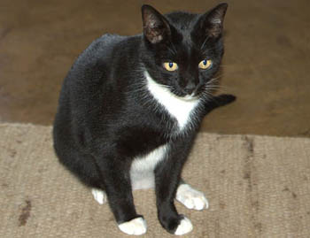
This is the only photo of her I have she answers to the name Missy and is black and white and about 8 months old. missing on Harper street and my phone number.

Thanks Shan.

From: David Thorne
Date: Monday 21 June 2010 9.26am
To: Shannon Walkley
Subject: Re: Poster

Dear Shannon,

That is shocking news.

Although I have two clients expecting completed work this afternoon, I will, of course, drop everything and do whatever it takes to facilitate the speedy return of Missy.

Regards, David.

From: Shannon Walkley
Date: Monday 21 June 2010 9.37am
To: David Thorne
Subject: Re: Re: Poster
 

yeah ok thanks. I know you dont like cats but I am really worried about mine. I have to leave at 1pm today.

From: David Thorne
Date: Monday 21 June 2010 10.17am
To: Shannon Walkley
Subject: Re: Re: Re: Poster

Dear Shannon,

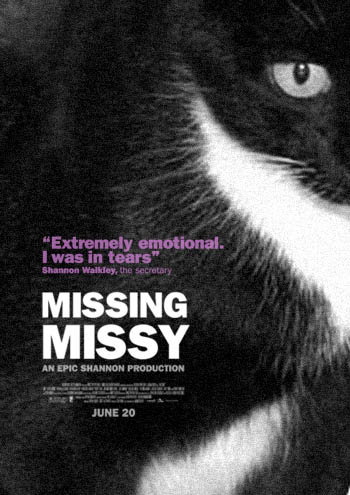
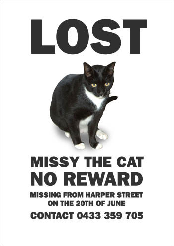
I never said I don’t like cats. Attached poster as requested.

Regards, David.

From: Shannon Walkley
Date: Monday 21 June 2010 10.24am
To: David Thorne
Subject: Re: Re: Re: Re: Poster

yeah thats not what I was looking for at all. it looks like a movie and how come the photo of Missy is so small?

From: David Thorne
Date: Monday 21 June 2010 10.28am
To: Shannon Walkley
Subject: Re: Re: Re: Re: Poster

Dear Shannon,

It’s a design thing. The cat is lost in the negative space.

Regards, David.

From: Shannon Walkley
Date: Monday 21 June 2010 10.33am
To: David Thorne
Subject: Re: Re: Re: Re: Re: Poster

Thats just stupid. Can you do it properly please? I am extremely emotional over this and was up all night in tears. you seem to think it is funny. Can you make the photo bigger please and fix the text and do it in colour please. Thanks.

From: David Thorne
Date: Monday 21 June 2010 10.46am
To: Shannon Walkley
Subject: Re: Re: Re: Re: Re: Re: Poster

Dear Shannon,

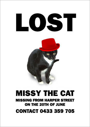
Having worked with designers for a few years now, I would have assumed you understood, despite our vague suggestions otherwise, we do not welcome constructive criticism. I don’t come downstairs and tell you how to send text messages, log onto Facebook and look out of the window. I have amended and attached the poster as per your instructions.

Regards, David.

From: Shannon Walkley
Date: Monday 21 June 2010 10.59am
To: David Thorne
Subject: Re: Re: Re: Re: Re: Re: Re: Poster

This is worse than the other one. can you make it so it shows the whole photo of Missy and delete the stupid text that says missing missy off it? I just want it to say Lost.

From: David Thorne
Date: Monday 21 June 2010 11.14am
To: Shannon Walkley
Subject: Re: Re: Re: Re: Re: Re: Re: Re: Poster

From: Shannon Walkley
Date: Monday 21 June 2010 11.21am
To: David Thorne
Subject: Re: Re: Re: Re: Re: Re: Re: Re: Re: Poster

yeah can you do the poster or not? I just want a photo and the word lost and the telephone number and when and where she was lost and her name. Not like a movie poster or anything stupid. I have to leave early today. If it was your cat I would help you. Thanks.

From: David Thorne
Date: Monday 21 June 2010 11.32am
To: Shannon Walkley
Subject: Awww

Dear Shannon,

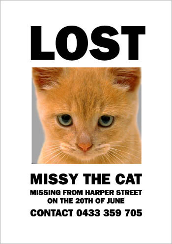
I don’t have a cat. I once agreed to look after a friend’s cat for a week but after he dropped it off at my apartment and explained the concept of kitty litter. I have attached the amended version of your poster as per your detailed instructions.

Regards, David.

From: Shannon Walkley
Date: Monday 21 June 2010 11.47am
To: David Thorne
Subject: Re: Awww

Thats not my cat. where did you get that picture from? That cat is orange. I gave you a photo of my cat.

From: David Thorne
Date: Monday 21 June 2010 11.58am
To: Shannon Walkley
Subject: Re: Re: Awww

I know, but that one is cute. As Missy has quite possibly met any one of several violent ends, it is possible you might get a better cat out of this. If anybody calls and says “I haven’t seen your orange cat but I did find a black and white one with its hind legs run over by a car, do you want it?” you can politely decline and save yourself a costly veterinarian bill.

Regards, David.

From: Shannon Walkley
Date: Monday 21 June 2010 12.07pm
To: David Thorne
Subject: Re: Re: Re: Awww

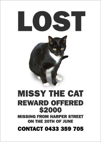
Please just use the photo I gave you.

From: David Thorne
Date: Monday 21 June 2010 12.22pm
To: Shannon Walkley
Subject: Re: Re: Re: Re: Awww

From: Shannon Walkley
Date: Monday 21 June 2010 12.34pm
To: David Thorne
Subject: Re: Re: Re: Re: Re: Awww

I didnt say there was a reward. I dont have $2000 dollars. What did you even put that there for? Apart from that it is perfect can you please remove the reward bit. Thanks Shan.

From: David Thorne
Date: Monday 21 June 2010 12.42pm
To: Shannon Walkley
Subject: Re: Re: Re: Re: Re: Re: Awww

From: Shannon Walkley
Date: Monday 21 June 2010 12.51pm
To: David Thorne
Subject: Re: Re: Re: Re: Re: Re: Re: Awww

Can you just please take the reward bit off altogether? I have to leave in ten minutes and I still have to make photocopies of it.

From: David Thorne
Date: Monday 21 June 2010 12.56pm
To: Shannon Walkley
Subject: Re: Re: Re: Re: Re: Re: Re: Re: Awww

From: Shannon Walkley
Date: Monday 21 June 2010 1.03pm
To: David Thorne
Subject: Re: Re: Re: Re: Re: Re: Re: Re: Re: Awww

Fine. That will have to do.

Posted in Amusement, Design Ethics, Actions & Impact

CSS Sprites: Now with 90% Fewer HTTP Requests

What are CSS sprites?

Sprite Basics: An Excellent Article by Chris Coyier (exerpt below from )

You’ve heard of them, but…

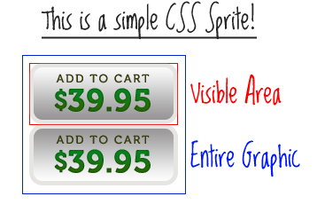
Do you really understand them? The name might be a little misleading, because sprites aren’t little images like you might be picturing, a sprite is actually one big image. Have you ever seen the CSS technique where the “on” and “off” states of a button are contained within the same image and are activated by shifting the background-position?


Here is an example of that on CSS-Tricks.

Think of CSS Sprites as an extension of that technique. The difference is that instead of just two or three images being combined into one, you can combine an unlimited number of images into one. The origin of the term “sprites” comes from old school computer graphics and the video game industry. The idea was that the computer could fetch a graphic into memory, and then only display parts of that image at a time, which was faster than having to continually fetch new images. The sprite was the big combined graphic. CSS Sprites is pretty much the exact same theory: get the image once, shift it around and only display parts of it, saves the overhead of having to fetch multiple images.

Why combine all those images? Isn’t it quicker to have smaller images?

Nope, it’s not. Back in the day, everybody and their brothers were “slicing” images to make pages load faster. All that technique did was fool the eye to make it look like the page was loading faster by loading bits and pieces all over at once. Each one of those images is a separate HTTP-Request, and the more of those, the less efficient your page is.

Let’s look at a quote from the article “Performance Research, Part 1: What the 80/20 Rule Tells Us about Reducing HTTP Requests” by Tenni Theurer on the Yahoo! User Interface Blog.

Table 1 shows popular web sites spending between 5% and 38% of the time downloading the HTML document. The other 62% to 95% of the time is spent making HTTP requests to fetch all the components in that HTML document (i.e. images, scripts, and stylesheets). The impact of having many components in the page is exacerbated by the fact that browsers download only two or four components in parallel per hostname, depending on the HTTP version of the response and the user’s browser. Our experience shows that reducing the number of HTTP requests has the biggest impact on reducing response time and is often the easiest performance improvement to make.

Table 1. Time spent loading popular web sites
Time Retrieving HTML Time Elsewhere
Yahoo! 10% 90%
Google 25% 75%
MySpace 9% 91%
MSN 5% 95%
ebay 5% 95%
Amazon 38% 62%
YouTube 9% 91%
CNN 15% 85%

Every single image, whether it’s an <img> tag or an background-image from your CSS is a separate HTTP-Request, so you can imagine how quickly those requests can wrack up.

OK. So how is it done?

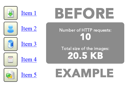
I thought you would never ask. Let’s start by showing the BEFORE example. Notice in the CSS below how the anchor tag does not get a background-image, but each individual class does.

#nav li a {background:none no-repeat left center} #nav li a.item1 {background-image:url('../img/image1.gif')} #nav li a:hover.item1 {background-image:url('../img/image1_over.gif')} #nav li a.item2 {background-image:url('../img/image2.gif')} #nav li a:hover.item2 {background-image:url('../img/image2_over.gif')} ...


Using CSS Sprites, we can really lighten this example up. Instead of having ten separate images for the buttons (five default states and five rollover states), we can literally combine all of them into one big long image. I won’t go into great detail about how this is done, I’ll just give you a basic walkthrough. Create a new image that is as wide as your widest image and and as tall as the combined height of all your images plus X pixels, where X is the number of images you have. Now place you images into this new image, left aligned, one on top of the other with one pixel of white space in between.

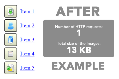
Now check out the AFTER example. Notice in the CSS that there is a single background-image applied to the anchor element itself, and the unique classes merely shift the background position with negative Y coordinates.

#nav li a {background-image:url('../img/image_nav.gif')} #nav li a.item1 {background-position:0px 0px} #nav li a:hover.item1 {background-position:0px -72px} #nav li a.item2 {background-position:0px -143px;} #nav li a:hover.item2 {background-position:0px -215px;} ...


We were able to reduce the number of HTTP-Requests by 9 and the total file size of the image(s) by 6.5 KB. That’s a pretty huge improvement for such a little example. Imagine what you could do on a full website.

Ugh. That sounds like a lot of work.

Just remember what Chuck Norris once said: “All great things require great dedication.” Actually I’m not sure if he said that or not, but it’s good advice anyway. But fortunately for you, there is a web service which makes creating and implementing sprites really easy.

…go read the whole thing.

Sprite Generators and Utilities

Posted in Amusement, Design History, Design Theory, Drawing, Education, Repost From Cited Source, Technical Geekery, Tutorial, Vocation & Profession, Web

Ofazomi Studio – No Edits for 24 Hours

If you have a site on the Ofazomi Studio network, please note that the network will be undergoing scheduled maintenance starting at midnight tonight. Any edits made to your site on January 24, 2012 may be lost. You may experience problems with site access as well.

Posted in Amusement

More Awesome

Posted in Amusement

Good Copywriting Tip o’ the Hat

Posted in Cleverness & Wit, Color Theory, Design History, Drawing, Typography, Visual Concepts