
Honestly now, don’t you wish your coding skills were better? Like most designers, you probably read code well but are not all that good at the writing part. Why not make 2012 your year? Click here to start immediately!
Honestly now, don’t you wish your coding skills were better? Like most designers, you probably read code well but are not all that good at the writing part. Why not make 2012 your year? Click here to start immediately!

What a great idea! Kickstarter is a micro-grant project that enables the likes of us to help fund worthwhile creative projects. (You can also post your project to find some funding.) Never thought of yerself as a benefactor, did ya?
Click here to get your creative project funded and help make other cool stuff happen.

(This tidbit is from Emigre. Go read the whole thing: here!)
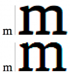
The variables of screen display generated by different browsers, screens, and user preference settings generate inconsistencies that are difficult to control. The above example shows the Malaga Regular web font lower case m at 24 px, and a 500% enlargement. The top image is from the Macintosh Operating System. The bottom image is Windows ClearType display. Both display samples are taken from an LCD screen.
Two sizes of the Malaga Regular web font shown in the extreme scenarios. In each size the top line is from the Macintosh Operating System. Bottom line is Windows ClearType display.
Each element is rotated 45° around a different axis: x (left), y (center) and z (right).