Antimatter

Breaking news yesterday was the startling news out of CERN that anti-matter can be caught, at least 38 atoms of it. Do you suppose humanity will use this new ability to improve the lives of the poor, ill-educated and hungry– with the resulting benefits of increased environmental protection, social equity and justice– or build more devastating weapons?

More importantly, what kind of branding will allow US “defense” contractors market this technology to Pakistan, India, Iraq and Israel simultaneously? I see a thousand points of light glinting in the eyes of  mercenary designers and I’m thinking the logo will be purple.

Posted in Design Ethics, Actions & Impact

Full-Time, Print-Design Gig: Chico, California

If you’ve done time at UG, you ARE qualified. (Thanks for the tip everyone.)

{———} has forwarded you this craigslist.org posting.

Please see below for more information.

Visit the posting at http://chico.craigslist.org/med/2066049183.html to contact the person who posted this.


Graphic Designer- Full Time

Date: 2010-11-17, 2:50PM
This is a shout out to all you experienced graphic designers that are looking for a full time gig. We just moved our 35 year old printing company to Chico and the response has been awesome. Our current designers are maxed out and looking forward to having a new designer join there team. You will have your own space in our new building, at the corner of Park and Martin Luther King Blvd in Chico. Your job will be to help bring the ideas of our clients to live in the form of postcards, vehicle wraps, billboards, forms, posters and the like.
Here is all we require from you.
Graphic Designer / Prepress technician: 2 yrs. exp. Prefered. Proficient in Indesign CS3, Illustrator CS3, and Photoshop CS3.
Principal Duties/Responsibilities:
• Operate a PC workstation equipped with popular graphic arts software to design and prepare electronic artwork for print.
• Use creative talent to visually enhance and improve print communication materials.
• Review and interpret customer needs and instructions, asking questions to ensure understanding, and offering creative suggestions when appropriate.
• Respond to the print production staff to ensure the original electronic file will flow smoothly into the rest of the production process.
• Create designs appropriate to individual budgets by considering the subsequent cost to produce design elements.
• Work directly with customers and our customer service staff in assessing and solving problems or question areas.
• Effectively manage multiple priorities
• Responsible for continual learning and self improvement. Need to keep up with the latest technology and design trends.
• Follow written and oral instructions accurately.
• Accurately record time and materials on daily time sheet.
• Perform job duties in accordance company rules.
Qualifications: 2+ years Graphics Design Experience
Location: Chico, California
Summary of Organization:
• Commercial Printer, Business forms, Business Stationary, Flyers, 4 Color-Cold-Set-Web, 2 Color Omin, 2 color ABDick 9870, Nexpress 2100, and Digimaster.
• Creative Composition officially began operations on November 1, 1968 in Southern California. In January 2000 Creative became a Corporation. 4 Partners.
• The business currently operates a copy shop and retail store from 396 Park Avenue, Chico, Ca.
Promotional Opportunities: Yes
Direct/indirect Reports: Pre-Press Manager
Performance Evaluation: Yearly
Overview of Benefits: Medical insurance after 6 mo. – Retirement plan, Business matches 3%.
Pay in accordance with experience
Please apply in Person or send us your resume’

  • Location: Chico
  • Compensation: Competitive hourly wage based on experiance
  • Principals only. Recruiters, please don’t contact this job poster.
  • Please, no phone calls about this job!
  • Please do not contact job poster about other services, products or commercial interests.

Original URL: http://chico.craigslist.org/med/2066049183.html

Posted in Employment, Repost From Cited Source

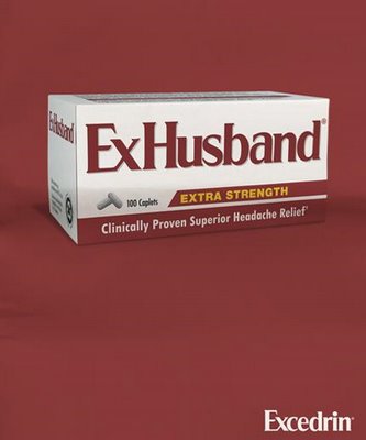
Proven Relief.

This is from a Toronto agency I think… anybody know the creatives involved on this one or when it ran?

If you liked these you may also enjoy these other bits of cleverness! Love, Ofazomi

Posted in Amusement, Cleverness & Wit, Mad Props, Visual Concepts

Direct Mail Tips For Your Clients

Anybody out there doing any direct mail these days? Email adverts are all the rage and easier to track but the printed piece lingers. Unfortunately, clients don’t see the point of white space, hence the existence of MakeMyLogoBiggerCream.com. Stop fighting them yourself and send them to this nice clear description of effective direct mail design by NorCal Presort shown below. The original is here.

The 6 Features of Graphic Design that Sell

The design of your mail piece has two jobs to do. One, it has to get attention for your primary offer. Two, it has to help the reader absorb the information that’s presented. Many of the desktop publishing computer programs come with templates to help. In fact, this software has created a generation of artists schooled in graphic design. Local printers usually know artists. The local telephone directory may have some listed. Also consider recruiting a design student from your local high school or college – they may be willing to help and may be reasonably priced. That said, you should still know what every well-designed mail piece has in common:

1. One thing dominates the page

When you look at a well-designed page, there is usually one dominant feature to catch your eye. It could be the headline or the picture, but not both. Something has to dominate. And while it might be tempting to throw in a little starburst that says “One Week Only,” be careful how you use it. When you emphasize everything, you emphasize nothing.

2. Minimize typeface variety

Your computer may come with 327 fonts, but that doesn’t mean you have to use every one of them. The best designers stick with one, maybe two per piece – plus the logo. A good rule of thumb is to use large, bold type for headlines and, if they’re particularly good, prices. Use a smaller, easy-to-read typeface for text.

3. White space

Don’t feel compelled to fill every inch of space with copy or pictures. A dense blob of type and pictures can look unattractive and turn readers away. An open and airy design is inviting and friendly.

4. Easy-to-read text

Equally important as the overall design of the page is the design of specific text blocks. If the type is too small or condensed, if the columns are too wide, if the paragraphs are too long, it becomes too much work to read and people won’t. Keep this in mind when creating letters, too. Break up the page by interspersing short paragraphs with long, indenting paragraphs, using bullet points or bold subheads.

5. Use relevant illustrations

The purpose of the illustration is to help draw attention to or dramatize your message. That’s not to say that a plumber has to show faucets in his mail or that a dentist has to show teeth. That plumber could, for instance, show Niagara Falls.

6. Clear, visible logo and call-to-action

You got the readers’ attention and guided them through enough information. You aroused their interest and desire. Now you have to let your readers know whom to buy it from and how. Don’t confuse a clear, visible call-to-action with a big, oversized name, address and phone number. Just make sure a reader can see these elements without having to look for them. Make it easy on the eye, but hard to ignore. The design of your mail piece has two jobs to do. One, it has to get attention for your primary offer. Two, it has to help the reader absorb the information that’s presented.

(Thanks for the tip Matt K. !)

Posted in Amusement, Repost From Cited Source, Visual Concepts, Vocation & Profession

Direct Mail Tips For Your Clients

Anybody out there doing any direct mail these days? Email adverts are all the rage and easier to track but the printed piece lingers. Unfortunately, clients don’t see the point of white space, hence the existence of MakeMyLogoBiggerCream.com. Stop fighting them yourself and send them to this nice clear description of effective direct mail design by NorCal Presort shown below. The original is here.

The 6 Features of Graphic Design that Sell

The design of your mail piece has two jobs to do. One, it has to get attention for your primary offer. Two, it has to help the reader absorb the information that’s presented. Many of the desktop publishing computer programs come with templates to help. In fact, this software has created a generation of artists schooled in graphic design. Local printers usually know artists. The local telephone directory may have some listed. Also consider recruiting a design student from your local high school or college – they may be willing to help and may be reasonably priced. That said, you should still know what every well-designed mail piece has in common:

1. One thing dominates the page

When you look at a well-designed page, there is usually one dominant feature to catch your eye. It could be the headline or the picture, but not both. Something has to dominate. And while it might be tempting to throw in a little starburst that says “One Week Only,” be careful how you use it. When you emphasize everything, you emphasize nothing.

2. Minimize typeface variety

Your computer may come with 327 fonts, but that doesn’t mean you have to use every one of them. The best designers stick with one, maybe two per piece – plus the logo. A good rule of thumb is to use large, bold type for headlines and, if they’re particularly good, prices. Use a smaller, easy-to-read typeface for text.

3. White space

Don’t feel compelled to fill every inch of space with copy or pictures. A dense blob of type and pictures can look unattractive and turn readers away. An open and airy design is inviting and friendly.

4. Easy-to-read text

Equally important as the overall design of the page is the design of specific text blocks. If the type is too small or condensed, if the columns are too wide, if the paragraphs are too long, it becomes too much work to read and people won’t. Keep this in mind when creating letters, too. Break up the page by interspersing short paragraphs with long, indenting paragraphs, using bullet points or bold subheads.

5. Use relevant illustrations

The purpose of the illustration is to help draw attention to or dramatize your message. That’s not to say that a plumber has to show faucets in his mail or that a dentist has to show teeth. That plumber could, for instance, show Niagara Falls.

6. Clear, visible logo and call-to-action

You got the readers’ attention and guided them through enough information. You aroused their interest and desire. Now you have to let your readers know whom to buy it from and how. Don’t confuse a clear, visible call-to-action with a big, oversized name, address and phone number. Just make sure a reader can see these elements without having to look for them. Make it easy on the eye, but hard to ignore. The design of your mail piece has two jobs to do. One, it has to get attention for your primary offer. Two, it has to help the reader absorb the information that’s presented.

(Thanks for the tip Matt K. !)

Posted in Amusement, Repost From Cited Source, Visual Concepts, Vocation & Profession