How to Write a Resume

Ok everybody, just chill. This isn’t rocket science. For your field it’s not even the biggest deal. Your portfolio is much bigger. Ok, ok, chill, chill, chill some more. We’ll get to that too.

GUIDELINES
A resume is a one page summary of your skills and experience.

Make your resume one page. Period. If you need more pages you will need to make a different kind of document, a curriculum vita (CV) letter. These are used primarily in Europe. You can find an example here: (click me). A resume is one page. Period.

Be sure to always tailor your resume to the audience.

e.g.: A graphic designers resume should be designed. Set it in Illustrator or InDesign and save as a PDF file. Your resume design should be a choice typographic example that matches your other promotional collateral such as your web site. Pay special attention to hierarchy, typography and kerning.

e.g.: If you are going out for a fashion job you want to be up front with your related (un)paid experience even if it jumps chronological order or omits that crap job you had bussing tables at Denny’s.

Use technical terms in your descriptions.

These get picked up by HR folks and machine scanners. e.g.: Don’t just say you did “imposition”, use the program name and beef it up to say “created PREPS imposition templates.”

Create clear outlines of information.

e.g.: Use bold, italics, color, indentation and different size fonts to convey your most important points. That said, DO NOT use not more than 2 colors, 2 typefaces and 3 type sizes. It confuses things.

Spell check before sending.

It matters.

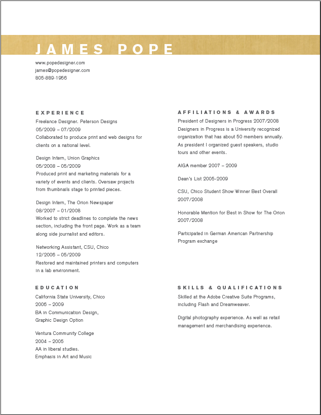
Example Graphic Design Resumes

Below are some example resumes posted online. Check them out and be inspired.

Templates For Non-Graphic Design Resumes

Below are some downloadable files to get you started on your resume journey to excellence. For the love of mercy, DO NOT use these Microsoft Word Templates if you are a graphic designer. Everybody else, have at the Word templates. It’s standard.

What Other Folks Say

You know what they say about free advice, right? Below are some good and varied opinions about resume writing for the creative professions.

Posted in Course Related, Editorial, Education, Portfolio Workshop, Repost From Cited Source, Resources, Vocation & Profession

Which Design Program? Which Design School?

Ofazomi.org is in the process of updating the educational resources section of this site. If you have any comments about your own design education you wish to share, please email or post. We would love to get alternate opinions on site.

The way you pursue your art and design education will affect the technique, maturation and substance of your work. Some potential employers care solely about “your book,” a portfolio of your artwork that shows off your talents.  Some potential employers care solely about where you went to school. Most employers fall somewhere in between. Whatever type of education you choose to pursue, work hard.

Public University v. Private Art School v. Top Tier

(well rounded, less debt, better integration of thinking and technique v. all art-all the time, more debt, better job prospects, better technique v. art school + belief in your ability to kick a**)

Most schools will never list among the “ivy league” of art schools. They are smaller, regional institutions. These schools are committed not to where you came from, but where you are going.  Most schools are book schools.  Book schools are all about hustle. Your “book,” or portfolio of sample art, had better outshine your top tier peers because the school name will not get you in the door. That said, the book folks have gotten through a lot of doors.

Ofazomi sits on both sides of this artificial public/private fence having both studied design and taught design in public university and private art school settings, including the top tier schools. Ofazomi has also hired folks from all these settings. Still, this remains a biased commentary with no claim of objectivity.

Why Public University?
At public university you will spend more time pursuing liberal arts requirements than your art school peers. Your liberal arts education will be of higher quality. It may feel like a waste of energy until the day it will hit you that these liberal arts subjects have forced you to think about interconnection, the very basis of art and design. Public university offers you substance.

Why Art School?
Art school offers you technique. The downside of being forced to become intellectually well-rounded at a public university is that you have less time for artmaking. Great technique is the result of practice. Art school students get more practice than public university students. Art school offers you polish.

ArtSchool

Why Top Tier?
There are top tier design programs at both public and private schools. These are “ivies” of design. The programs are competative to enter and usually very expensive. Designers who come out of the “ivy league” of art schools have several advantages:

  • Healthly alumni networks mean that grads know about open positions before the rest of us.
  • Grads have wealthier and better connected school friends as a result of going to an expensive school.
  • Many ivy league artists believe that they are better trained and tend to hire others like themselves.  It’s an ego thing.

That last point matters. You are who you believe yourself to be. Statistically, once the wealth of your parents is taken to account, your choice of educational institution makes absolutely no difference by any measure: ability to think critically, earning power, skills, connections, etc. On a personal level however, belief in your superiority can yield professional dividends. You go out for jobs that should intimidate. You are confident in your ability to tackle projects bigger than you have ever done before. You aim higher. Top tier offers you self confidence.

Leveling The Field
Your job, regardless of how you choose to educate yourself, is to create more work than you think you are capable of and polish it so it outshines any work another design school grad can present. You have to make the time to work on your work. You need to find people who will give you honest feedback on a weekly basis so that work can be polished. Drive and discipline really pay off in this profession.

Posted in Education, Resources

ID Badge + Transcript = CS4 for 85% off

*** Act Now! *** Limited Time Only! *** Operators Are Standing By! ***

CS5 hits April 12th. Right now you can take advantage of an additional $50 off an 80% Adobe student discount on CS4 products. Get the deep discount now and upgrade later! More info is available on the Adobe website. You DO NOT need the latest, greatest edition of the Creative Suite, especially as a student when you are learning the basics. Being one version behind the curve is totally acceptable and often preferable.

Posted in Education, Resources

Auspicious Occasion!

Post100FortuneCookie

Create your own fortune here: Fortune Cookie Generator

Oh, and if you liked this, you may also enjoy these other posts! Love, Ofazomi

Posted in Amusement, Fiddling & Time Wasters, Shameless Plug

Line Length! or Thank You Anthony Jones!

It is very easy for new designers to have difficulty with line length. Like most typographic principles, It is not something we are taught throughout school. We arrive fresh to the concept at college. Bad line length choices give your design an amateurish feel.  Master proper length and your layouts will gain clarity and polish. Below is a post by Anthony Jones explaining clearly what it’s all about. The original can be found here. Read it. Love it. Do it. Teach it to others.

Typography 101 – Line Length

Line length is pretty much what it says on the tin. It is the maximum length of a single line of text before the next word in a sentence ‘wraps’ onto the next line underneath. This is correctly referred to as the ‘measure’ of a paragraph which seems to be a dying phrase.

Here’s the deal. The eyes and brain can only stay focused on a line of text for so long before fatigue kicks in and the reader loses position which destroys the reading process. Some boffins once came up with an optimum line length of an alphabet and a half, or about 39-45 letters. This is obviously far too prescriptive a rule to maintain but it does serve as a yard stick when evaluating a paragraph or column of text for good readability.

line_length1

The example above shows 3 paragraphs of text with progressively smaller line lengths. As the line length decreases the readability increases.

Specific layouts will require you to dictate varying line lengths every time you set copy. Often, other factors like a maximum screen or page area and underlying grid systems will make most of the decisions for you, but just remember the basic rule that in almost all cases the shorter the line length the easier it is to read.

Posted in Course Related, Education, Repost From Cited Source, Resources, Typography, Vocation & Profession